
A good e-commerce landing page can determine whether clicking on your store leads to quitting or conversion. With e-commerce seeing heightened competition, an optimised landing page is essential for conversion rate optimisation.
Your landing page is the face of your brand and product; your first impression is crucial in deciding if the potential customer will stay, explore your offerings, or bounce off. ROI of Landing Page: Studies reveal that a well-optimised landing page can generate over 200% increase in conversion rates. It is a vital aspect of any successful online store.
But what is it that makes a landing page effective? It’s the right blend of convincing content, enticing website design for sales, obvious CTAs, easy navigation, and an optimal user experience. In this guide, we will share actionable e-commerce landing page tips to help you create pages that convert and establish trust.
When you finish reading, you’ll know precisely how to structure and optimise your landing page to convert visitors into paying customers.
What Makes an E-commerce Landing Page Effective?
Before diving into design and conversion rate optimisation strategies, let’s first define what an effective e-commerce landing page should achieve:
- Capture Attention Quickly – The page should load fast and have a visually appealing layout.
- Communicate Value – The product’s benefits should be immediately apparent.
- Encourage Action – Strong CTAs should guide users towards making a purchase.
- Optimise for Mobile – With more users shopping on mobile devices, mobile responsiveness is key.
- Reduce Distractions – The page should be focused on one goal: conversion.
- Ensure Trustworthiness – Include social proof, customer reviews, and security badges.
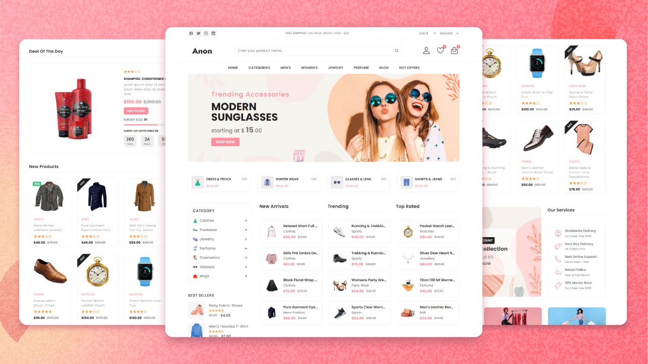
Quick Guide: 7 Elements Every E-commerce Landing Page Needs
- Clear, Benefit-Focused Headline – Capture attention fast and explain the product’s value.
- Persuasive Subhead – Reinforce the offer with urgency or a unique selling point.
- High-Quality Visuals – Use lifestyle images, product demos, and 360° views to build trust.
- Strong CTA Buttons – Action-driven copy and bold, contrasting design in multiple places.
- Customer Reviews & Social Proof – Real testimonials, ratings, UGC, and trust badges.
- Mobile-First Design – Fast-loading, responsive pages that work on any device.
- Streamlined Checkout – Fewer form fields, guest checkout, and secure payment gateways.
Pro Tip
Use “Yes” CTA copy for a psychological nudge. Phrases like “Yes, I want this!” or “Yes, send me my free sample!” create momentum and feel more personal.
Important Note
Speed = Conversions. Every second your page delays in loading could cost you up to 7% in conversions. Optimise image sizes and scripts for lightning-fast performance.
Essential Elements of a High-Converting Landing Page
1. A Compelling Headline
The headline is the first thing visitors see. It should be:
- Clear and concise – Communicate the product’s value immediately.
- Benefit-driven – Focus on how the product solves a problem.
- Actionable – Encourage users to take the next step.
Example: Instead of “Running Shoes for Sale,” use “Run Faster & Longer with Our Ultra-Lightweight Shoes.”
A strong headline grabs attention and makes visitors want to learn more. If your landing page isn’t clear about what it offers within the first 3-5 seconds, you risk losing potential customers.
2. Persuasive Subheadings
A subheading should complement the headline by:
- Expanding on the product’s key benefits.
- Creating urgency or exclusivity (e.g., “Limited Edition – Only 50 Pairs Left!”).
- Highlighting a unique selling point (USP) – What makes your product better than competitors?
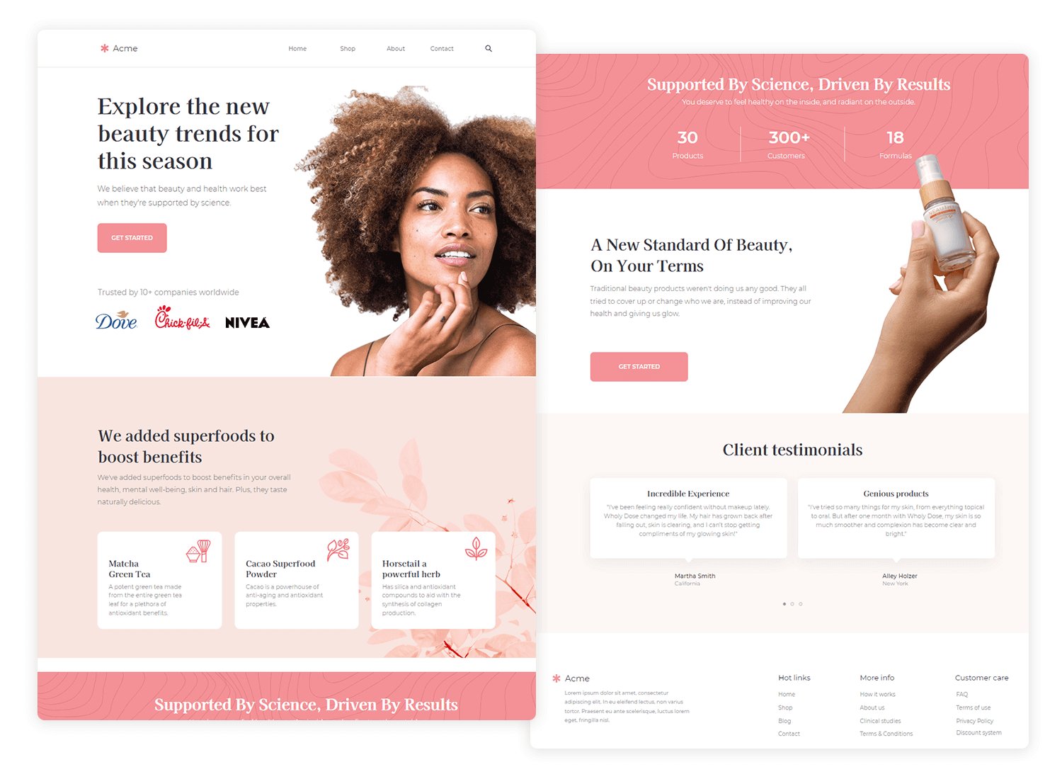
3. High-Quality Images & Videos
Visual content is crucial for website design for sales. Here’s how to use it effectively:
- Use High-Resolution Images – Show multiple angles of the product.
- Include Lifestyle Images – Help customers visualise using the product.
- Leverage Videos – Demonstrate how the product works.
- Incorporate Zoom & 360° Views – Give users an interactive experience.
A report by Shopify revealed that pages with high-quality images see up to 40% more conversions than those without. Consumers trust what they can see, so providing clear visuals helps them make informed decisions.
4. Strong Call-to-Action (CTA)
A well-placed CTA button can significantly impact conversions. Best practices include:
- Use contrasting colours to make the CTA stand out.
- Keep the text action-oriented, such as “Buy Now,” “Get Yours Today,” or “Start Your Free Trial.”
- Place multiple CTAs throughout the page for convenience.
- Use first-person phrasing like “Yes, I Want This” for a personal touch.
CTAs should appear above the fold, within the body content, and at the bottom of the page to increase engagement.
5. Customer Reviews & Social Proof
Building trust is essential for conversion rate optimisation. Display:
- Customer testimonials with real names and photos.
- Ratings & reviews to add credibility.
- Trust badges (e.g., “100% Money-Back Guarantee,” “Secure Payment”).
- User-generated content (UGC), like social media posts featuring the product.
A BrightLocal survey found that 91% of consumers trust online reviews as much as personal recommendations. Including authentic customer feedback can significantly boost confidence in your product.
6. Mobile-Friendly & Fast Loading
- Ensure mobile responsiveness so users can shop seamlessly on any device.
- Optimise loading speed by compressing images and minimising unnecessary scripts.
- Test performance using tools like Google PageSpeed Insights.
7. Simple & Secure Checkout Process
A complex checkout process can deter buyers. Simplify it by:
- Offering guest checkout to speed up the process.
- Minimising form fields to only essential information.
- Providing multiple payment options for convenience.
- Adding progress indicators to show how many steps are left.
Baymard Institute reports that nearly 70% of online shoppers abandon carts due to complicated checkout processes. A seamless checkout ensures more completed transactions.
Optimising Your Landing Page for Conversions
1. Keep It Focused
Avoid clutter. Every element on the page should have a clear purpose: to drive conversions.
2. Use Heatmaps & A/B Testing
Track user behaviour using heatmaps to see where they engage the most. Run A/B tests on:
- Headlines
- CTA buttons
- Images & videos
- Layout & colour schemes
3. Leverage Urgency & Scarcity
Create urgency to encourage immediate action:
- Use countdown timers for flash sales.
- Highlight low stock levels (e.g., “Only 5 Left in Stock!”).
- Display recent purchases to show demand.
4. Personalised User Experience
Use dynamic content to tailor the experience based on the visitor’s behaviour and preferences. For example:
- Show related products based on browsing history.
- Offer location-based shipping estimates.
- Use exit-intent popups to capture abandoning visitors.
5. Improve Page Load Speed
Studies show that even a 1-second delay in load time can reduce conversions by 7%. Optimise speed by:
- Using fast web hosting.
- Compressing images.
- Reducing redirects and unnecessary scripts.
FAQs: Common Questions About E-commerce Landing Pages
1. How long should an e-commerce landing page be?
- It depends on the product. For simple products, keep it short and direct. For high-ticket items, provide detailed content.
2. Should I use video on my landing page?
- Yes! Videos boost engagement and increase conversions by up to 80%.
3. What colours work best for CTAs?
- Bright, contrasting colours like orange, green, and red tend to perform well.
4. How do I reduce bounce rates on my landing page?
- Ensure fast loading times, engaging visuals, and a clear CTA.
5 Frequently Asked Questions (FAQs)
br>
1. What’s the difference between a homepage and a landing page?
A homepage introduces your brand, while a landing page is designed for one goal: conversion—usually from a specific ad, campaign, or product.
2. Should I include a navigation menu on landing pages?
Not always. Removing nav links can reduce distractions and keep users focused on your call to action.
3. How can I test which landing page version works best?
Use A/B testing to compare variations of your headline, CTA, or layout. Tools like Google Optimize or VWO can help.
4. Are pop-ups okay on landing pages?
Yes—especially exit-intent popups or limited-time offers. Just don’t overload the page or interrupt key actions.
5. How often should I update my landing pages?
Regularly review your analytics. Update based on user behaviour, seasonal offers, and A/B test results to improve performance continuously.
Build Landing Pages That Convert
It is not just the aesthetics of a high-converting e-commerce landing page that matter; it is about strategic layout, content and user experience. These ecommerce landing page tips will help you create pages that increase sales, boost customer engagement and improve your bottom line.
Are you planning to upgrade your conversions? So today, optimise your landing pages and see your e-commerce sales grow!